Get Higher Rankings, Traffic, and Patient Bookings with Spectacular Dentist Website Design
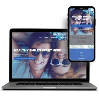
Impress patients and attract more appointments with a user-friendly and visually appealing dental website design. Our high-converting dental websites are SEO-optimized, mobile-friendly, aesthetically pleasant, and 100% customized for your unique dental services. Get the best website design for dentists that makes your site rank on search engines and converts patients.
100% client satisfaction
180% growth in website traffic
30+ In-house team experts
8+ years of experience
Why Professional Dentist Website Design is Crucial for Your Dental Practice
Typically, your dental website is the first point of contact for your online visitors and potential patients. An informative, user-friendly, modern website sparks trust and builds credibility, gently encouraging your visitors to turn into real-time patients. High-converting dental websites allow you to showcase your dental services, expertise, USP (unique selling proposition), and patient testimonials in a sophisticated and engaging manner.
Additionally, a professional website serves as your practice’s 24/7 marketing tool, guiding visitors about the treatment options, contact information, business hours, and location. Having an optimized website design also does wonders for local SEO, targeting patients actively seeking your services and drawing them towards your dental practice. Invest in top website design for dentists to improve your digital presence, accelerate traffic, and convert more patients than ever.
Our Full-Spectrum, Advanced Website Design & Development Services for Dentists
Our website design agency for dentists specializes in crafting patient-focused, high-performing websites, perfectly optimized to grow your practice. Take a look at our comprehensive website design and development services:
Custom Design & Branding
Creating an aesthetically striking design that is a treat for eyes and reflects your dental practice's values and brand identity.
User Experience (UX) & User Interface (UI) Design
Designing interactive layouts and intuitive navigation, making it easy for patients to access information and book appointments.
Mobile-First & Responsive Design
Ensuring your dental site looks top-notch and functions optimally on every device, including smartphones, laptops, and desktops.
Click-To-Consultation Journeys
Strategically adding calls-to-action (CTA) buttons on the website, and optimizing patient forms that turn visitors into warm leads and confirmed appointments.
SEO-Friendly Design
Building high-converting dental websites while following the best SEO practices to optimize them for search engine algorithms and maximize their visibility.
Content Integration & Optimization
Integrating and optimizing website content reflecting your services, blog content, and patient resources to engage and convert dental patients.
WordPress Website Design Services
Specializing in designing robust and flexible WordPress websites, providing straightforward content management for your team.
Feature Integration
Integrating all the fundamental and essential features in your dental website, including patient forms, testimonials, appointment scheduling, virtual tours, and patient portals.
Robust Security Implementation
Protecting your dental website with solid SSL encryption and following security protocols to guarantee data protection and HIPAA compliance.
24/7 Customer Support
Providing complete support in the pre-launch and post-launch phases, catering to unique queries 24/7.
Ongoing Website Maintenance
Regularly optimizing your website to align with the algorithm updates and maintaining it to continuously increase search engine rankings.
Website designers and developers with expertise in the best website design for dentists handle all these services, guaranteeing undivided attention and excellent results.
Transparent Pricing & Affordable Website Design Services for Dentists
You don't need to break the bank for a high-converting dental website. Our affordable website design services with transparent pricing do the trick nicely. Your investment depends on the following:

Design Scope
A 5-page dental website costs differently compared to a custom-built portal featuring treatment planners and online booking.

Content Requirement
The cost of professionally written content optimized for dental practices varies from the basic template text.

Custom Functionalities
Standard templates cost less than custom functionalities such as HIPAA-compliant forms.

Ongoing Value Addition
Ongoing website maintenance and support come with an additional cost.
Whether you opt for a basic dental website design or a high-end, custom website, we guarantee zero hidden fees with no compromise on quality.
Why Work With Our Website Design Agency for Dentists
Our commitment to quality excellence and dental-specific expertise has made us the best website design agency for dentists. Take a look at the reasons why dental practices trust us to craft the best website design for dentists.
Dental Industry Expertise
Specializing in website creation for dentists, we design sites with a focus on patient psychology, trust signals (testimonials, doctor bios, treatment visuals), and specific CTAs, thereby reducing friction in the patient appointment journey.
Proven Track Record
We boast a stellar portfolio of top-notch website designs for dentists, accompanied by genuine client testimonials that build your trust in our services.
Powerful SEO Integration
Our website designs aren't only beautiful, they are optimized from day one with schema markup, local SEO, and mobile-first performance (Core Web Vitals scores 90+).
Conversion-Focused Design
Our website design experts craft each element, whether it's an emergency appointment prompt or a HIPAA-compliant form, with the patient experience and conversion goals in mind.
Holistic Approach & Solutions
By practicing a holistic approach, we provide a comprehensive range of website design and development services.
Dedicated Experts
A dedicated and creative website designer and developer works on your dental website, providing complete focus to create the top website design for dentists.
Your practice deserves to grow, and your website needs to be seen. Work with us to get a scroll-stopping website.
Our Seamless Process of Creating the Best Website Design for Dentists
At The Dental SEO Experts, we don't just create websites—we build high-converting dental websites that get your practice the eyeballs it deserves. Here's how we craft the top website design for dentists.
Discovery & Strategy
Our experts study your dental practice and its competitors, understand your brand identity and audience, and conduct in-depth local SEO keyword research to create a conversion-focused design strategy.
Patient Journey Wireframing
We create a visual blueprint of the website, appointment-focused user flows, and a mobile-first layout while mapping the entire patient acquisition journey.
Conversion-Optimized Design & Development
Next, we bring the visual concepts to life with a custom dental theme, HIPAA-secure form integration, and ADA-compliant navigation.
Content & SEO Optimization
Our professionals populate your dental site with SEO-optimized and persuasive content and engaging media, ensuring it has a solid local SEO foundation.
Testing & Launch
We rigorously check your website across different browsers and devices, scan for broken links, verify if the forms work correctly, and launch it once it passes all the pre-launch tests.
Ongoing Performance Monitoring
After launching your website, we continuously monitor it, implement security updates and speed optimizations, and track the conversion rate using Google Analytics audits.

9 Signs Your Dental Practice Needs A Sophisticated Dentist Website Design
Your website isn't fulfilling its core purpose if it isn't generating leads and patients. If you struggle with any of the following, your website is screaming for a dentist website design overhaul.
- Your patients keep telling you how outdated your website is
- It doesn't load quickly on mobile phones
- Mobile users struggle to book an appointment on your site
- You have a low conversion rate and high bounce rates
- Potential patients call to ask even basic questions
- Your dental website is hardly visible in the search engine results
- It is difficult to add new content and features, and update your site
- Your website doesn't feature the latest dental services you offer
- The site's content management system (CMS) is completely outdated
Don't let your website cry more for your attention. Let us revamp it, and give you the top website design for dentists.
Our Success Stories: Real, High-Converting Dental Websites
We don't just make claims of creating high-converting websites. Our genuine success stories prove that we fulfill all our promises.
A general dentistry practice in Houston was consistently losing patients due to its outdated website. We redesigned the site, introduced one-click scheduling, optimized the service pages with local SEO, and added a smile gallery featuring before/after cases. The site now has 340% more bookings and a 45% lower bounce rate than before.
Facing extreme competition, an orthodontist from Middle Town sought our website design and development services. Our website design and development specialists added 3D smile simulation videos and updated the content with new visuals. The redesigned website saw a 75% increase in sign-ups.

Ready to Convert Your Dentist Website Design into a Surefire Patient Generator?
With The Dental SEO Experts by your side, you don't need to lose patients to competitors anymore. Our custom and contemporary dentist website design will significantly increase your patient bookings.
Contact us today for a FREE, no-pressure consultation to discuss what your dream website should look like.
Please fill out the form below, and our experts will respond to you shortly.
Claim Free Website Design Consultation
The team at Dental SEO Experts have been a game changer for our online presence. Within a short span of less than two months, they catapulted our dental website to the top 3 in Google's ranking for Laguna Beach. Having tried other SEO companies in the past with little to no progress, we were initially skeptical. However, Tom and James proved to be an exceptional duo who not only exceeded our expectations but also delivered tangible results that speak volumes about their expertise and dedication. The impact on our online visibility and organic traffic has been great for business. They took the time to understand our specific goals and tailored their strategies accordingly. Throughout the process, they maintained clear and timely communication, ensuring we were always in the loop and addressing any questions or concerns promptly. I highly recommend their services to anyone seeking to achieve online success.
Adam Vaghari, Owner, DDS, Laguna Beach Dentist

